What are the kitchen cabinet colors for 2025?
Introduction: Why 2025 Cabinet Colors Matter
Color is no longer a finishing touch—it’s a strategic tool that shapes mood, resale potential, and how a kitchen feels in daily life. In 2025, cabinet colors balance serenity with character: warmer neutrals, nature-rooted greens, sophisticated darks, and earthy browns are all in rotation. These shades align with broader shifts toward comfort, authenticity, and materials that age gracefully. Below, you’ll find a practical framework for choosing a palette that complements your light, layout, and lifestyle.
Outline
– The big picture: what’s new in 2025 and why it matters
– Warm neutrals and creams: the contemporary foundation
– Nature-driven greens: biophilic color with staying power
– Deep blues and charcoals: dramatic yet livable contrast
– Earth, clay, and browns: warmth through paint and wood stain
– Two-tone palettes and finishes: how to test, pair, and maintain
– Conclusion: decision checklists and next steps
The Contemporary Foundation: Warm Neutrals and Creams
In 2025, the backbone of many kitchens is a family of warm neutrals that feel grounded and human. Think creamy off-whites, light mushroom, beige with a whisper of gray (often called greige), and soft taupes that sit between warm and cool. These are not stark or hospital-bright; they’re easy on the eyes and play beautifully with layered textures—stone counters with subtle veining, hand-formed tiles, and brushed metals. Their appeal is practical, too: they reflect light without amplifying glare, and they harmonize with both warm and cool accents.
A helpful way to evaluate these shades is through Light Reflectance Value (LRV). Creamy off-whites often land around 75–85 LRV, bouncing a generous amount of light and making small kitchens feel more open. Mid-tone mushroom or taupe can sit around 40–60 LRV, still bright but calmer, with enough depth to hide smudges and micro-scratches. Choosing by LRV is less about memorizing numbers and more about balancing daylight, artificial lighting temperature, and how clean you want the space to appear in photos and in real life.
Undertone is where many color regrets begin, so slow down and compare how a neutral leans in your home’s light. A “warm” neutral can skew yellow, red, or pink; a “balanced” neutral may carry a faint green or violet that only appears at dusk. To decide:
– Sample two to three undertones of the same depth and tape them on several cabinet doors.
– Check morning, midday, and evening to see if a hidden undertone appears.
– Hold samples next to your flooring and counters, not just against a white wall.
Pairings are straightforward. Creams love honed stone and aged brass. Greige and taupe welcome cooler stainless accents and soft-black hardware for definition. For two-tone setups, park lighter neutrals on upper cabinets to keep the room buoyant, and use a slightly deeper neutral on lowers for visual stability. The result is timeless without feeling plain. For households concerned with upkeep, a satin or matte sheen in these families hides fingerprints more comfortably than high gloss while still wiping clean with a damp cloth. Whether your kitchen is contemporary or classic, warm neutrals in 2025 offer a calm canvas that frames food, conversation, and daily rituals rather than competing with them.
Nature-Driven Greens: From Sage to Olive
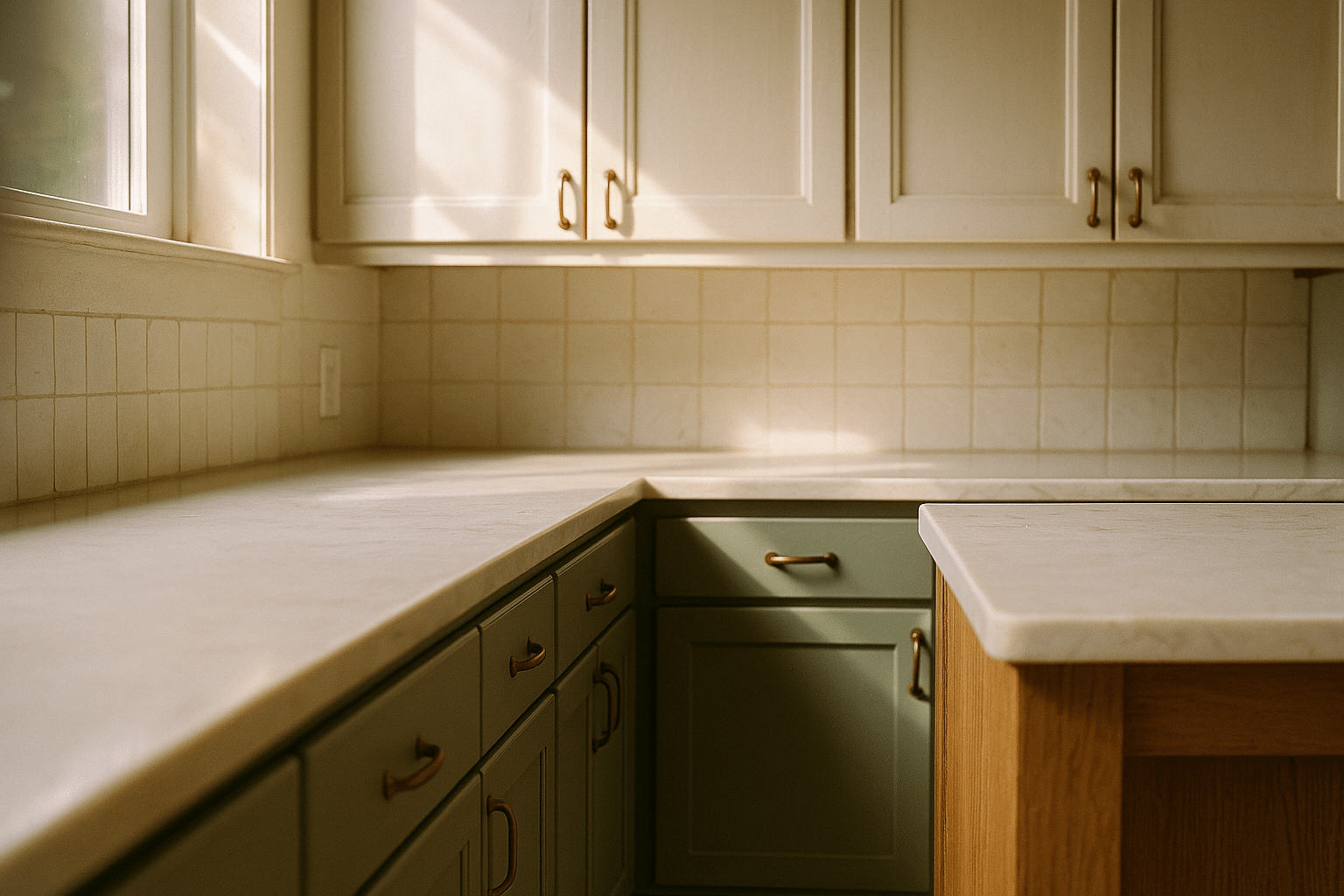
Greens are moving from accent to anchor in 2025, reflecting an ongoing desire for biophilic spaces that cue rest and resilience. The most livable versions are herbaceous: silvery sage, celery with gray in the mix, and olive softened by brown. These tones absorb light rather than shouting, and they flatter natural materials—oak floors, soapstone counters, unglazed ceramics. Instead of a novelty, they read as “quiet character,” giving a kitchen personality that doesn’t exhaust the eye.
Color psychology and practical maintenance both favor green for high-use rooms. Soft sages and muted olives calm visual noise and are forgiving to everyday wear. Mid-depth greens—often around 20–45 LRV—conceal smudges and the occasional cabinet scuff better than very light paints. If your kitchen faces north or lives under cool LEDs, a green with a touch of yellow or brown can counteract chill; for sunny, south-facing rooms, a slightly grayer green reins in brightness and prevents an overly yellow cast at midday.
How to build a cohesive palette around green cabinets:
– Counters: creamy marbles, soapstone, or quartz with warm veining enhance botanical notes.
– Backsplash: zellige-style or handmade-look tiles in off-white, pale clay, or a desaturated green for tone-on-tone depth.
– Metals: aged brass warms sage and olive; brushed nickel or stainless adds crispness to grayer greens.
– Wood: white oak, ash, or walnut accents keep the scheme organic and layered.
Placement matters. If you’re hesitant, trial green on the island or lower cabinets first, balancing uppers in a soft neutral. This keeps sightlines open and prevents a heavy feel. For galley kitchens, a gentle sage is especially helpful, as it recedes visually and makes corridors feel less tight. For open plans, olive grounds large spaces and provides just enough contrast to define the kitchen zone without hard borders.
Longevity is part of the appeal. Green connects to nature, which tends to outlast fads, and the palette adapts across styles—from shaker doors to minimalist slab fronts. Add woven textures, linen runners, and matte ceramics, and you get a tactile, inviting kitchen that supports everyday cooking as well as weekend gatherings. In short, 2025’s greens aren’t a splashy moment; they’re a steady rhythm that makes the whole room breathe.
Deep Blues and Charcoals: Dramatic, Not Dark
Moody blues and charcoals are gaining traction as intentional contrasts rather than all-over color blocks. The new approach emphasizes depth without heaviness: inky blue lowers with creamy uppers, charcoal islands under pale stone, and slate-toned tall units that frame integrated appliances. These hues typically occupy the low end of the LRV spectrum—roughly 5–20—so where and how you place them matters. Used thoughtfully, they carve architectural lines and elevate modest materials, turning a simple kitchen into a composed, gallery-like space.
What keeps these shades livable is warmth. Many of 2025’s charcoals bend brown, and the favored blues carry a touch of black or green rather than electric saturation. Under soft morning light, they look velvety; under evening LEDs, they offer clarity and edge. They photograph beautifully without masking every fingerprint the way ultra-matte black can. In compact kitchens, try a darker island only, or use deep tones on the base run and wrap the room with light elsewhere. For larger rooms with high ceilings, a full bank of deep cabinetry can provide balance and a sense of permanence.
Smart pairings ensure harmony:
– Countertops: off-white stone with warm veining, leathered dark stone for a monolithic look, or light terrazzo for texture.
– Hardware: patinated brass adds glow; soft-black or pewter keep things tailored.
– Backsplash: off-white or pale gray tile with handmade texture to soften the formality.
Maintenance sits between easy and moderate. Fingerprints show more on flat, near-black finishes; a satin sheen reduces that while keeping the color saturated. If you cook frequently with oils and sauces, prioritize wipe-friendly paints and consider door styles with minimal grooves. For homes concerned with resale, deep blues and charcoal accents signal sophistication while allowing future owners to adjust surrounding elements easily. The net effect in 2025 is confident rather than austere—color that frames food and friends like a good stage set, then steps back so the evening can unfold.
Earth, Clay, and Browns: Warmth Through Paint and Wood Stain
Earth tones—clay, terracotta, cocoa, and coffee browns—are bringing kitchens back to the comforting side of the spectrum in 2025. These hues look especially convincing when paired with visible grain: oak, ash, and walnut finished in matte sealers, natural oils, or light tints that let the wood breathe. After years of cool gray everything, a return to warmth feels both fresh and familiar, like sun-warmed pottery or bread just out of the oven. The key is to avoid heavy, flat browns and instead favor nuanced shades with red, orange, or pink undertones (for vibrancy) or a touch of gray (for restraint).
Painted clay tones land roughly in the 25–50 LRV range, which is high enough to keep a kitchen luminous but deep enough to hide wear. On wood, subtle stains or smoked finishes can emphasize medullary rays and cathedral grain, adding pattern without busyness. For durability, a matte or low-sheen topcoat keeps glare low and touch-ups discreet. If your floors are already warm, balance the palette with an off-white backsplash and cooler metals; if your envelope leans cool, let clay and cocoa be the warmth that ties the room together.
Pros and considerations:
– Pros: inherently cozy, forgiving to daily use, pairs well with stone and woven textures, and ages gracefully as surfaces develop a gentle patina.
– Considerations: strong terracotta can read orange in direct sun; test samples across the day to ensure it stays grounded. Rich browns may darken small, windowless rooms—reserve them for islands or lowers if space is tight.
Compositions that sing include clay uppers with wood lowers, or walnut towers flanking clay-painted base runs. Stone choices—travertine, limestone, and warm-veined quartz—reinforce the natural story. Hardware can swing rustic or refined: hammered brass amplifies warmth; brushed stainless sharpens the profile. To prevent a monotone effect, introduce texture: ribbed paneling on an island, handmade tiles with slight color drift, linen shades at the window, or a nubby runner underfoot. The emotional payoff is big. Earth and brown palettes feel hospitable from morning coffee to late-night tea, offering a sense of place that honors both tradition and today’s preference for calm, tactile interiors.
Two-Tone Palettes, Finishes, and How to Choose for Your Space
Choosing a cabinet color for 2025 is about orchestrating light, function, and mood. Two-tone schemes remain popular because they balance mass and movement: lighter uppers keep sightlines airy, while deeper lowers or a focused island add weight where you need it. Combining tone and texture is equally effective—think painted frames with stained oak inserts, or smooth slab fronts next to ribbed panels. Finish matters just as much as color: matte and satin dominate because they reduce glare, hide minor wear, and feel sophisticated without tipping into showroom shine.
Start with constraints, then layer preferences. Map your light: a north-facing room often cools colors, south-facing light warms them, and east/west exposure shifts throughout the day. Test under the bulbs you’ll use—2700K casts warm, 3000–3500K sits neutral-warm, and 4000K reads cool and can gray-out subtle undertones. Sample generously with at least two depths per hue family (light and mid; mid and dark). Tape color boards on adjacent doors and observe over 48–72 hours. If you have glossy counters, a matte cabinet paint provides textural contrast; if your counters are honed, a soft satin adds gentle reflectivity.
Practical shortcuts:
– Small kitchens: prioritize high-LRV uppers (70+) and mid-tone lowers (35–55) to balance openness and durability.
– Busy households: favor mid-depth colors and satin finishes to disguise fingerprints and micro-abrasions.
– Open-plan rooms: use a deeper island or pantry wall to anchor the volume and separate zones visually.
– Historic homes: choose desaturated tones with gentle brown or gray undertones to harmonize with aged floors and trim.
Two-tone combinations that consistently work include cream + sage, mushroom + charcoal, clay + off-white, and olive + natural wood. For hardware, keep shapes simple; the color story should lead. If you’re color-shy, let the island carry the accent—green, blue, or charcoal—while perimeter cabinets stay neutral. If budget is tight, repaint only doors and drawer fronts, leaving interiors as-is; color still transforms sightlines. And remember maintenance: a quality primer, two color coats, and a light final sanding before the last pass will extend the life of your finish. In short, pick the hue that supports how you cook, clean, and gather; a great palette is not just seen, it’s lived with comfortably.
Conclusion: Your Next Steps to a 2025-Ready Palette
Define your goals—cozy, bright, dramatic—and shortlist two families that express them. Collect large samples of a light, a mid, and a deep option, then test in your actual light across several days. Pair samples with your counters, flooring, and hardware to check undertones, and choose a matte or satin finish based on how you use the room. For many homes, a warm neutral base plus a nature-driven accent delivers longevity and charm. If you’re still undecided, start modestly: repaint an island or a single run of lowers, live with it, and refine. Done this way, your 2025 kitchen color story will feel both current and uniquely yours—inviting in the morning, flattering at night, and resilient all year long.


